After having revamped our marketing pages last month, we’re launching our new beautiful UI for the app today. Let’s take a closer look at all the changes.
A fresh look for the app
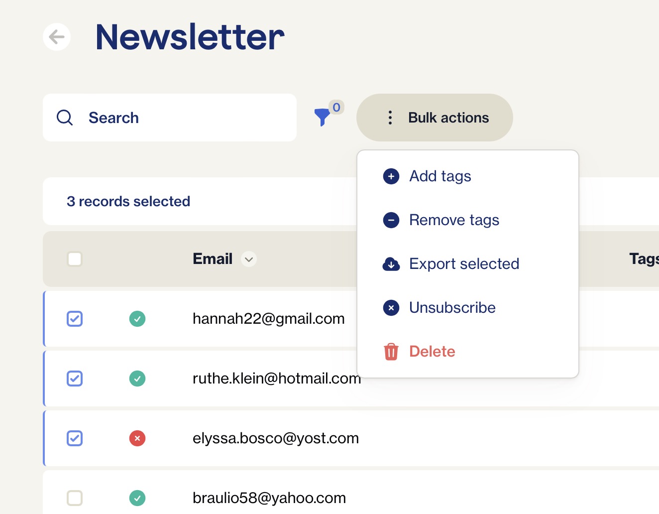
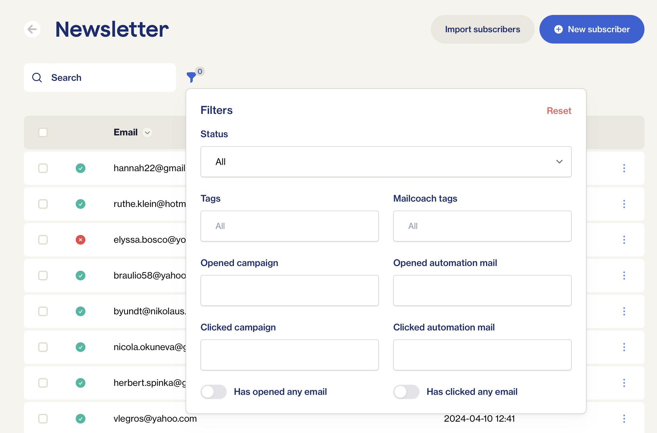
Let’s dive straight in, here’s how a list of subscribers now looks like.
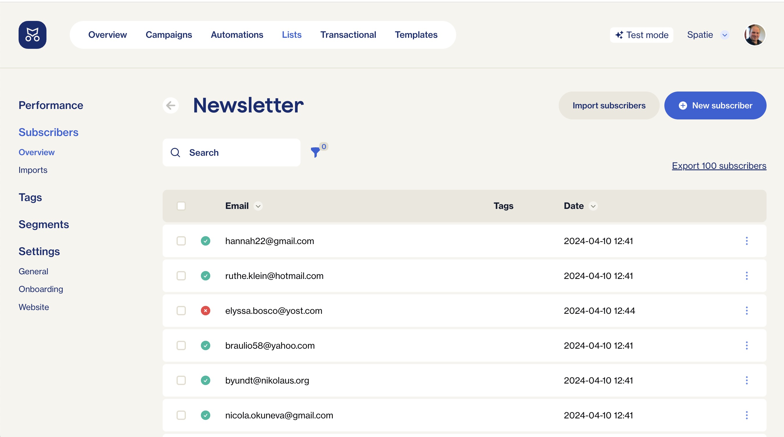
If you’ve used Mailcoach previously, you’ll notice immediately that this screen has been redesigned from scratch. The colours, font and general layout have all been updated to reflect the design we introduced to our marketing pages.
Behind the scenes we use Filament to render those tables. We’ve highly customised how the look, so you don’t have the feeling you’re looking at the stock tables. Of course, every list has powerful sorting, search, bulk actions and filtering options that you know and love from Filament.
Easy to use automations
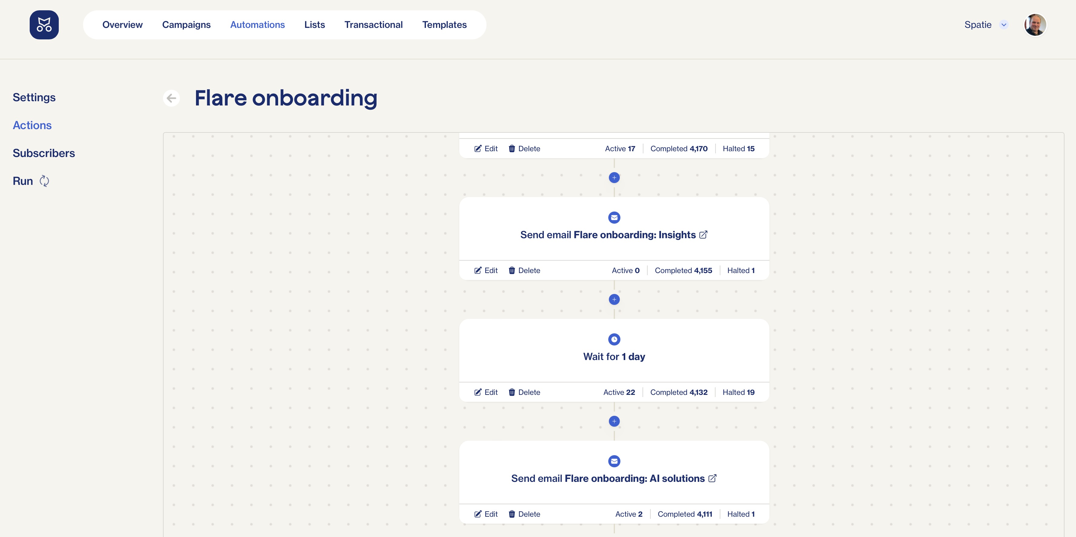
Email automation is one of the most powerful features in Mailcoach. Using automations you can build up any email flow you might need. You might also know this as “drip campaigns”.
We’ve totally revamped how automations look. Here’s a simple automation where a mail is sent 10 minutes after somebody signed up.
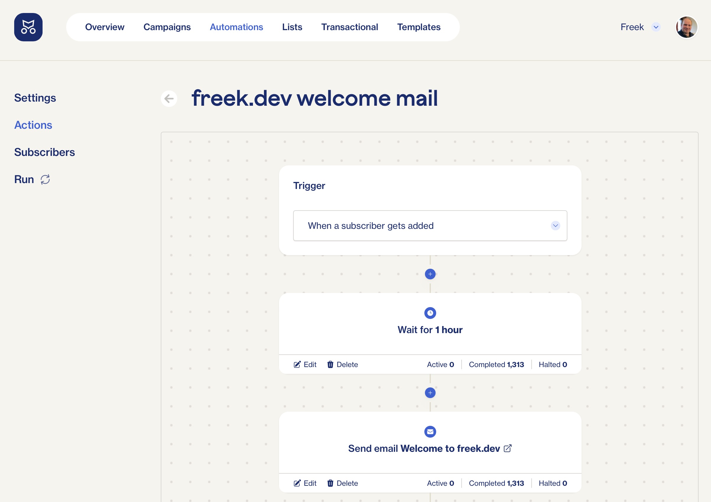
At Spatie, we use this feature to send a couple of mails during the trial period on Flare.
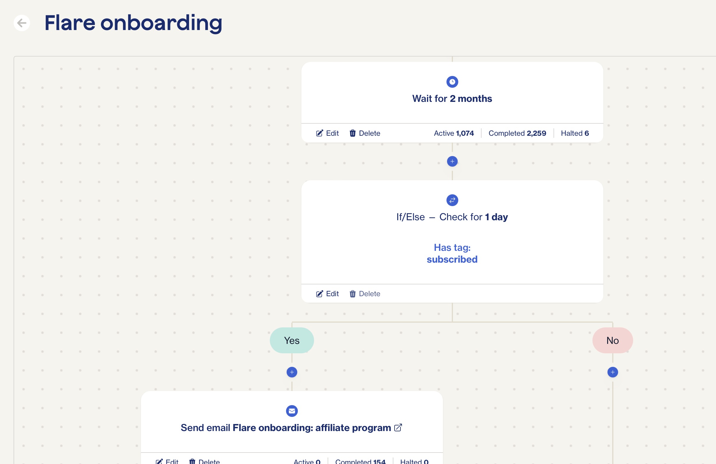
The real power of automations comes into play when using branching logic. For Flare, we’ll automatically invite people that are subscribed after two months since onboarding, to our affiliate program.
Self-hosted Mailcoach
Next to the hosted version of Mailcoach, we also offer a self-hosted version. This version has been updated as well. Because we need to update every view, we decided to tag it as a new major version. You’ll find the upgrade notes here.
In closing
With both the Mailcoach marketing pages and the Mailcoach app itself updated to the new design, we feel that the Mailcoach platform is on another level now.
Do take a look for yourself by starting a free 14-day trial.