Everyone is invited
Looking at our previous website and messaging, we generally played the “affordability” card. And while we are still an affordable solution, we wanted to go beyond focusing on price and highlight some of our other, more unique features.
A closer look at the landscape of email marketing platforms reveals a lot of options, many of which have very comparable features and prices. The ability to monetize your content is just about the biggest difference between these platforms these days.
Mailcoach has always been email first, and monetization is not something we offer (yet). However, we do tick a lot of boxes: newsletters, segmenting, automation, and drip campaigns to name a few.
Knowing what kind of platform we are, and what we bring to the table was the first step. The next question: who uses our product? Because we’re a small development company best known for our open source development work, it is no surprise that many of our customers are developers themselves. Or at least users with a technical background.
Labeling all our users as developers would be too crass. In many cases, they’re also entrepreneurs or business owners. They depend on platforms like Mailcoach to connect with their customers and create campaigns to find new ones.
And knowing that, our platform suddenly becomes a whole lot more than just a tool to send emails with. We have built lots of different, powerful features that are useful for not only developers but also people building businesses, selling courses, keeping their audiences updated about a new product release, etc.
As you open our new homepage, notice we proudly cycle through many different types of users: startups, creators, developers, and marketeers. Everyone is invited. To make sure they feel at home, we’ve created several pages for these users, explaining how they can use our useful features to their advantage.
More than a new lick of paint
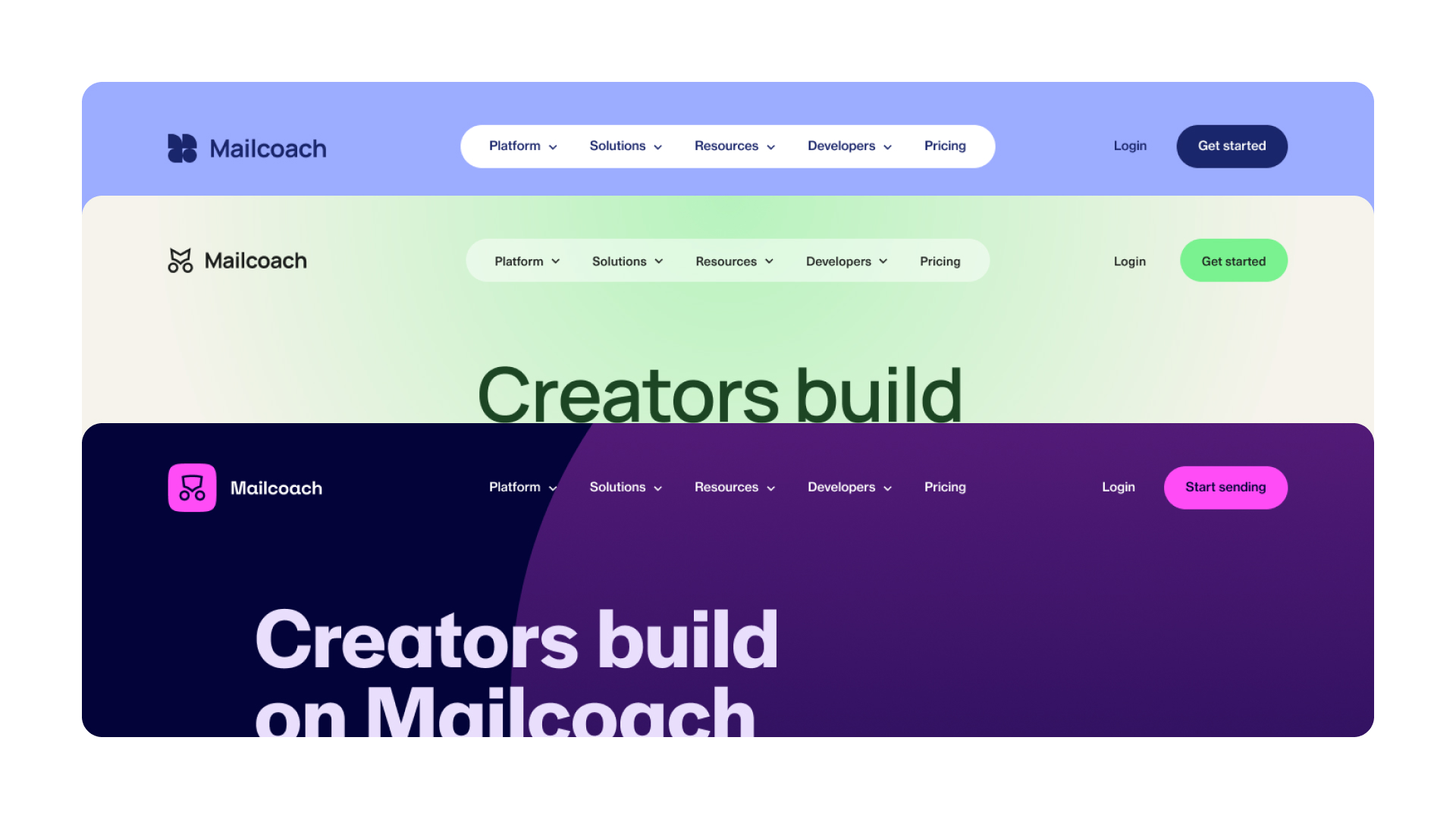
Along with the new website, we also took the time to redesign the whole Mailcoach brand. As with any redesign, we explored several routes, some more radical than others.

After finding a combination of colors, typography and an overall “vibe” we liked, we then spent a lot of time on graphics, finding ways to explain our features, targeting people who are not always familiar with modern marketing slang like “drip campaigns” or “split testing”.
We tried to be colorful, but serious, and abstract but still easy enough to understand. A terrible brief for a designer. (ed: the person writing this article is the designer responsible for this brief).
The result is a brand that feels welcoming, which was one of the main goals of our redesign: our doors have always been open for anyone to join, but now there’s no denying that we’re truly a platform that focuses on creators and people who do cool things.
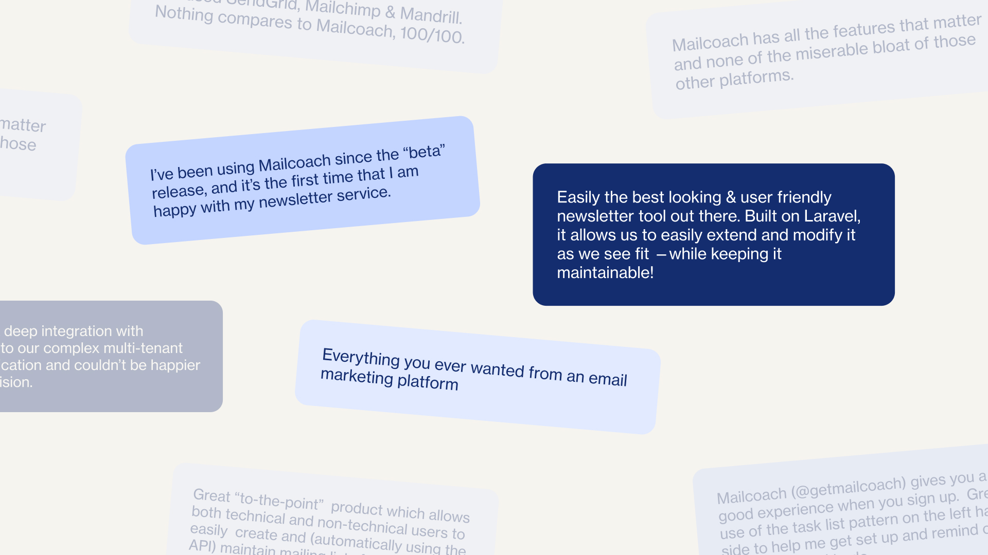
And we’re quite proud of our customers. They seemed to like us so much that they offered to write nice things about us, so in return, we thought it would be nice to put them front and center. As you navigate through our website, you’ll see many short reviews and quotes from our customers pop up, helping us convince you to give Mailcoach a try. Did it work?

Moving some stuff around
Part of the redesign was also to make it easier to find useful content about Mailcoach. For new users, who can use a helping hand to navigate the interface, it isn’t always easy to search the documentation, especially if you are not familiar with the core concepts of Mailcoach.
To address this, we moved all information about working with Mailcoach under a new central location: “Learn Mailcoach”. Opening this page, you are greeted with a list of categories, each of which deals with a different part of the interface or functionality. For new users, this breakdown will help them understand Mailcoach’s various features more quickly.
In addition, we have also moved some of the content that was previously hidden in the blog into two separate categories, “Switching to Mailcoach” and “Integrations.”

An ongoing process
The new website sets us up for the future, and gives us plenty of options to highlight our product and our users better. We are already looking forward to applying the new branding to the product itself in the coming months.
We’re excited to hear what you think! And if you’re not a user of Mailcoach yet, now is the best time to get on board. We’re probably the best email marketing platform if you’re a builder, creator or developer – or just someone who’s passionate about their hobby, project or business and needs a flexible platform to reach and grow an audience.